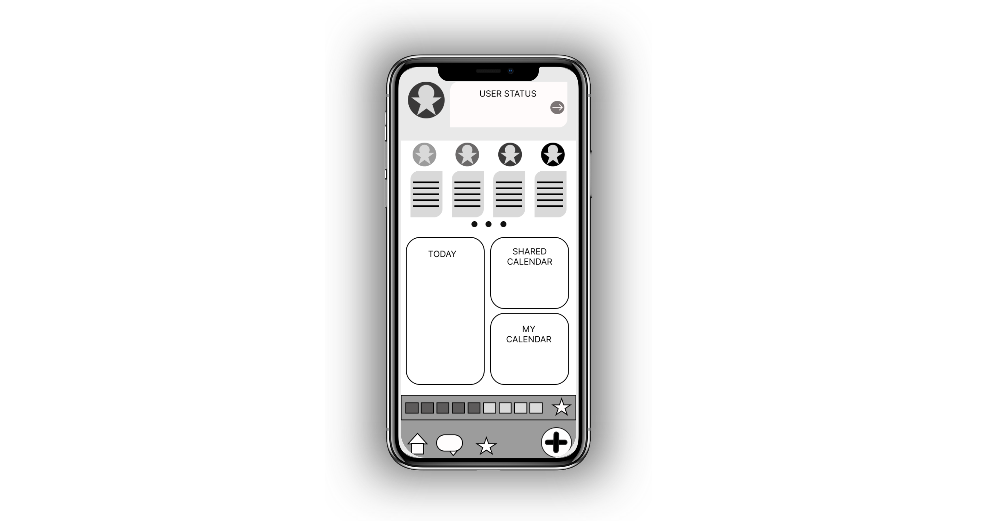
paper and low-fidelity wireframes


Starting The Design
I began with paper wireframes to quickly map out layout ideas and test key user flows based on research insights. These evolved into digital wireframes and a low-fidelity prototype built in Figma, allowing me to validate functionality early with real users.
-
Paper wireframing & iterative sketching
-
Digital wireframes in Figma
-
Interactive low-fidelity prototyping
-
Task-based user flow design
-
Prioritizing content hierarchy & accessibility
Skills Showcase
Mal needed a way to quickly check if Riley had updated her schedule without texting her.
Riley just wanted a way to add plans that didn’t feel like homework.
Their shared frustration shaped how I approached layout, flow, and ease of interaction.
Client Stories
-
Users respond better to tap-based, low-effort interactions than traditional form fields.
-
Shared visibility was critical, but clarity in distinguishing personal vs. family events needed to be baked into the layout.
-
Messaging was not essential—action-based alerts held more value for families trying to stay in sync.
Project Insight
HOME
+ EVENT
REWARDS
CALENDAR


I started with paper wireframes to quickly draw out layout ideas and user flows without overcommitting to visual details. This allowed me to prioritize necessary elements and test different navigation structures before moving to digital tools.
.png)


